


by Dio Cramer
A full two years into legal-liquor buying, I consider myself to be somewhat of an expert. Just kidding! The truth is that I am still at the stage of life where price is the most important variable in choosing my alcohol. After that, I turn to the design of the label, which is a much more interesting way to choose liquor.
A little intro for y’all since I am new to the blog — Hello! My name is Dio and I have been doing graphic design for France 44 and the Cheese Shop for about a year now after getting my start in the wonderful St. Paul Cheese Shop. I’m a designer and illustrator, a Capricorn, and also someone skeptical of the “don’t judge a book by its cover” mentality. You can certainly judge it after you have actually read the book, but up until that point, I believe the cover can give you a valid sense of what lies ahead and whether or not it’s going to be worth it. Same goes for liquor. Even before I knew what kinds of liquors I liked the taste of, I loved looking at the labels.
Labels, bottle shapes, and general marketing is incredibly important in the world of liquor. These elements form a personality that draws targeted demographics towards (or away from) a specific bottle and often guide them in choosing one bottle over another. This is especially influential when you can’t taste the very thing that you’re buying. Designers use visual aids to tell a story that we internalize, either consciously or subconsciously, and help us form opinions about the bottle before popping the cork.
With liquor labels, I’ve found that the great designs seem to fit into two main categories: nostalgia and novelty. Some brands stick with the same design that they have been using for years, and other newer brands try to emulate that same classic or nostalgic vibe. This feels right for liquor that is aged or brands aiming for a sophisticated look. On the flip side, many brands use novel designs to try and get customers to pay attention to their bottle and buy their product. This latter category of novel designs is what I focus on in this piece, but perhaps there is another blog post in the future that dives more into the history of liquor labels and explores the nostalgic and classic designs.
A liquor store is a fantastic place to explore the contours of your design tastes and expand your design terminology. To begin, I spent some time comparing the Gin section to the Whiskey section. The difference is stark. Obviously, whiskey is a much darker liquid than the clear gin, so right away the two aisles feel emotionally different. Many of the whiskey labels had dark caps and labels with contrasting white text. The serif and script fonts combined with dainty flourishes create a vintage and old-timey feeling. Age is an important factor in whiskey so many of these bottles have large numbers incorporated into the design, advertising how many years the whiskey aged. Most of the classic whiskey brands are aiming for that classic, dated look.
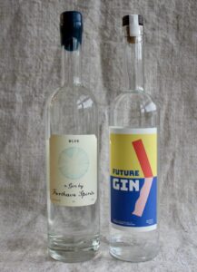
The gin aisle, on the other hand, has a much lighter and more modern feeling. It seems that the goal here is timelessness. Many labels have thin text with light decorative elements, and blues and greens seem to be the primary colors of choice. One of my favorite label designs is Future Gin, followed by the “Blue” from Forthave Spirits. These two designs are eye catching, but for different reasons. Forthave Spirits is emulating old homemade concoctions with their handwritten script label. A bottle like this would fit into the apothecary vibe, which I’ll admit I am a sucker for. The Future Gin is immediately eye catching with colorful (yet pastel) abstract art. It looks modern but in a kind of timeless way.
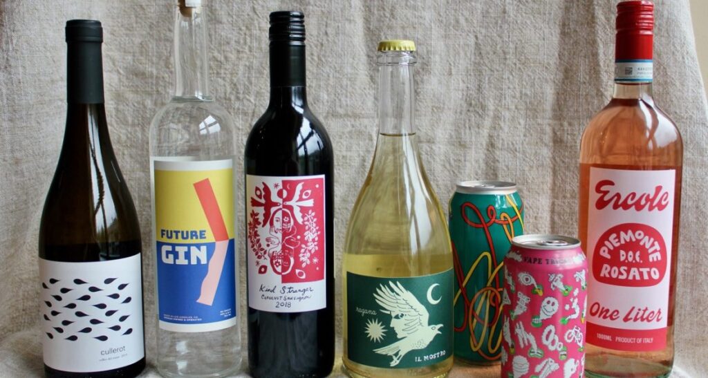
Moving on to the rest of the store, I chose bottles that stood out to me, and then tried to sort them into distinguishable sub-categories. I came up with: bold graphic, hand-drawn, geometric, tarot card, and new-wave psychedelic.
BOLD GRAPHIC
The tactic here is obvious – designing a beautiful bottle that sticks out among the rest. Some of these have only illustrations and minimal text, some use the text as the graphic to draw your eye, but all of them will capture your attention as you scan the aisles.
HAND-DRAWN
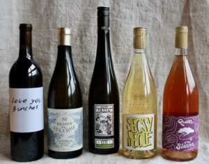
I am particularly drawn towards hand-drawn art, partly because that is what I do and partly because it adds a human element to design. These bottles have character–they feel more alive than their neighbors. These can feel modern like the pen and highlighter design of Secsy Mbole, or elegant and nostalgic like the Branco de Sta. Cruz. If I were to design a liquor label, it would probably fit amongst these hand-drawn labels.
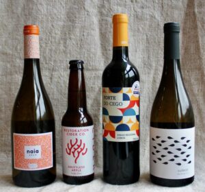
GEOMETRIC
Geometric style of graphic design has far deeper roots than I can explore in a single blog post, but these bottles sure are eye-catching. In particular, these stand out from the nostalgic-style of many liquor labels. These designs are decidedly modern, which gives them a classy feeling. I might choose one of these as a gift. Elegant and lively, a good visual addition to any house (Of course, I’d hope the contents were appreciated too.)
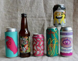
NEW-WAVE PSYCHEDELIC
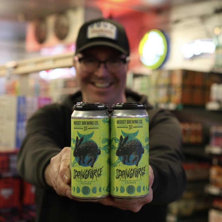
This sub-category is specifically for beer labels. If any wine or spirit bottles in our shop fit into this category, I certainly missed them. Craft beers are all the rage these days. They are popping up left and right, and the makers have turned to wild, out-there marketing in an attempt to distinguish their products from the rest. Many of these labels are designed to appeal to counter culture stoner types, much like the psychedelic phase of the 60’s. To that point, I am currently drinking Prairie’s Vape Tricks, which is not only delicious, but visually a piece of pure stoner art with green and yellow mouths blowing trippy shapes out of smoke. Craft beer is certainly the most graphically out-there of the liquor world, and these labels do not disappoint.
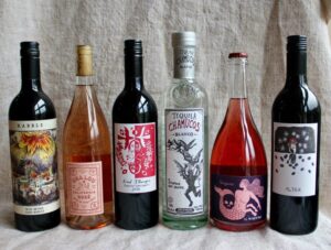
TAROT CARD INSPIRED
Last, and perhaps most interestingly, is the theme of the Tarot cards. The other subcategories I found are general design categories, but this is thematic and much more specific. These bottles are characterized by mythological figures, magical themes, and hand-drawn illustrations that emulate the design and feeling of tarot cards. Some feature biblical-like scenes of destruction and devils like Rabble and Chamucos, and some are more mystical and whimsical like Alter, Kind Stranger, and Il Mostro. Perhaps it’s the long history of witchcraft and alcohol-like concoctions that make these bottles so appealing — or perhaps it’s the figures that give them so much character — but these are the bottles I am most intrigued by. Each of these designs contain a story, and the intrigue into that story is what makes me curious about the liquor inside.
What are the labels you are drawn to? Are they nostalgic or novel? Crisp geometric shapes or hand-drawn mystical? Does the personality of the label match the contents?
Personally, I plan on taking home Il Mostro, Kind Stranger, and Future Gin, where I can promise you these bottles will live on in my home as vases and other vessels once the alcohol is long gone, as I am unable to get rid of beautiful bottles or jars of any kind. Maybe then I can report back on the full sensory experiences of these liquors, contents included.